Wow, so this morning was very productive..and FUN! I basically had two professionals go through my entire house and tell me what I needed to change. Sally is really her name and you can read more about her here. She’s the Director of Creative Services at Hunter Douglas. And my mom owns a Hunter Douglas gallery and has been making draperies for most of my life.
Sally took the lead while my mom gave input where necessary when she knew my tastes differed from what Sally proposed or just as a confirmation of a good idea. I ended up carrying a notebook around and had a full page of ideas by the end of the 2 hours.
I will try to share with you what she told me to do. And I apologize mostly to Sally but also to you readers for the pictures you are getting ready to see. Basically I had to go old school and paint the changes on pictures of the house I took today. Truth be told, it was fun but it looks like Emma could have done it. Scratch that…Lexi.
The biggest changes will be in the kitchen and master bath and just a few tweaks in the sunroom, hallway, kids’ room and hall bath.
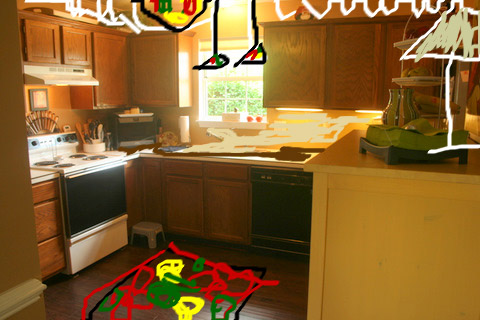
Before kitchen:
OK, this is what’s happening:
- Replace the countertops with this Burnished Glaze formica. Mainly for budget purposes we’re not doing granite. We don’t plan to be here more than 5 years and it may out-do this neighborhood if we sink too much money into it.
- Change the sink to a beige porcelain.
- Put a biege/gold glass tile back-splash. I love glass tile and think this will be cool. She wants to do the back-splash in a lighter color since the floor, cabinets and counter top will now all be dark.
- I was going to put up recessed lighting but she suggested putting a Tiffany chandelier up to replace the current black and brass ceiling fan (puke) and then two pendant lights above the sink. This would serve double-duty as a window covering since we have a blind already and don’t really have a privacy issue.
- Take down all the stuff from above the cabinets and replace it with rope lighting.
- Put down a 4×6 colorful rug in the center of the open area.
- Put a lamp on my yellow cabinet. Nickel base with a neutral shade.
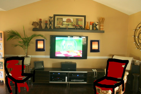
Before living room:
- Already out of this picture is a lamp she had us move from beside the glider to the recliner. Our lighting was very unbalanced in the room.
- Add the lighting beside the TV. She even sat and looked online to help us pick these out. These are better because the light is shining out and not just up and down like some wall lighting.
- Since the main four pieces of furniture we have in the living room don’t really go together, she suggested replacing the two chairs (sort of left-overs) with two brightly colored/fun/modern chairs that matched on either side of the TV.
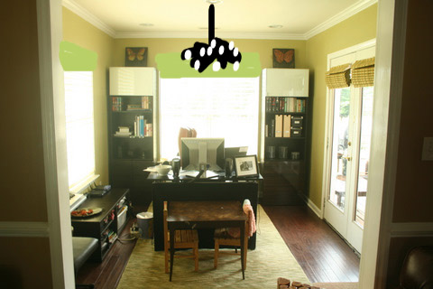
My office. Just a few things to top it off.
- Put valences above the windows (I know it’s hard to see) with the same fabric that is on the doors.
- Replace the center recessed lighting with a fun chandelier.
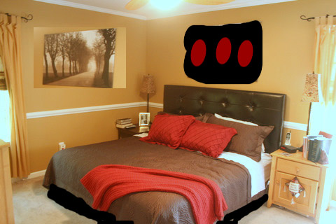
Before Bedroom:
- My main concern was that plain wall to the side. She suggested another large piece of art. It looks small in the pic, but that is a King size bed. My mom suggested I move the neutral tree picture to the side wall and then get another picture that is neutral and maybe a hint of red in it for above the bed.
- Get Scott to actually build the platform bed. But that we knew.
Now for the master bathroom (excuse our bright orange towels!):
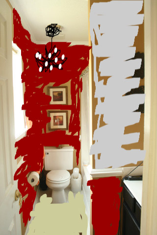
For the first time maybe ever, someone scared me with a wall color. I really wish I had on film my reaction to her suggestion to paint the bathroom…..RED. Red is a very tricky wall color. It can go orange. It can look messy around the trim. It can be loud. It makes a statement. BUT. What I asked for in that bathroom was something bold. I wanted it to be spa-like. I wanted it fancy.
- Paint the walls red.
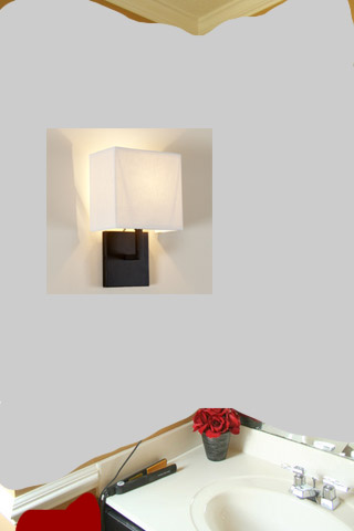
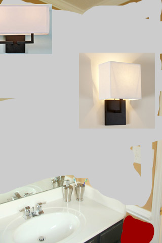
- In the niche above the sink, do counter-to-ceiling mirrors.
- Put in a sconce on each side wall at eye level.
- Put new lighting above the sink higher than the other two.
- Put a iron/clear glass chandelier above the toilet area. (that was my idea, yay amy)
- Tile the floor in a neutral porcelain tile (mainly for resale)
- She suggested to keep our current counter and base.
OK, if this makes any sense:
So those were helpful RIGHT?? LOL
A few other random things:
- In the kids’ room, we should buy the shadow boxes from Pottery Barn and put the kids’ artwork.
- In the hall, I have 3 large collage frames. She suggested using molding to build a very large frame around them and use wall lettering to put “Bennett” above them. She said it wouldn’t look like “3 dots on a wall”.
- In the main bathroom, again she suggested counter to ceiling mirror. She also suggested a neutral tile flooring again. Although for the kids, she suggested doing the floor AND ALL THE WALLS with tile. Or at least up to a chair molding height. It’s an easy clean.
- She also rearranged things on my foyer table. She says when doing tablescapes, to remember items should be grouped in 3’s.
So that’s it. There are a few quick fixes here but mainly, Scott now has a very long to-do list and Mom and I have A LOT of shopping to do.
Good Evening, I don’t usually post suggestions upon web, as i prefer to read only. However We discover the post you have created earlier has really informative information, and that i discover it very educational. I was searching on Aol 4 information on personal development and discovered your valuable publish. Could you publish something exactly the same informative regarding how to personal improve quick? Regards.
Cool and good, there is certainly actually some good points in this particular post some of my friends will dsicover this relevant, will send them one of the links, many thanks. Fantatic blog! Really good stuff below. Thanks